


 Image
Travel posters
Wild Postcards — Retro Travel Poster
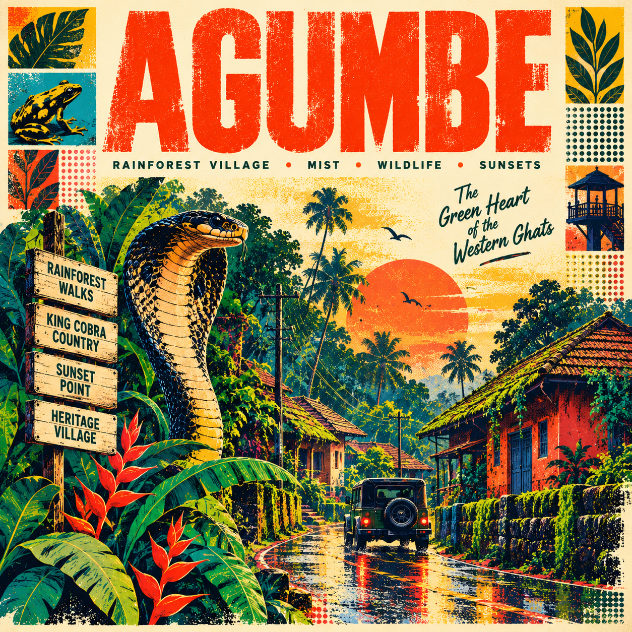
Wild Postcards turns destinations into expressive retro travel illustrations inspired by vintage tourism advertising, screen-printed gig posters, and nostalgic travel ephemera. Each design combines oversized distressed typography, tactile ink textures, halftone patterns, bold geometric shapes, vivid color contrasts, and carefully curated local details. From wildlife-rich rainforests and historic villages to bustling cities, deserts, coastlines, and cultural districts, every poster tells a unique visual story rooted in the destination's real identity.
Create an exceptional, visually striking retro screen-printed travel poster celebrating {{DESTINATION}}, located in {{REGION_OR_COUNTRY}}.
The final artwork should resemble a collectible vintage tourism advertisement reimagined through contemporary graphic design: bold, colorful, tactile, nostalgic, energetic, and unmistakably connected to the destination.
1. Destination-Aware Creative Direction
First, interpret the destination's real-world identity and identify the visual elements that make it distinctive.
Destination: {{DESTINATION}}
Region or Country: {{REGION_OR_COUNTRY}}
Signature Identity: {{SIGNATURE_IDENTITY}}
Distinctive Landmarks or Architecture: {{LOCAL_LANDMARKS}}
Wildlife, Flora, or Natural Details: {{WILDLIFE_AND_NATURE}}
Local Culture and Lifestyle: {{CULTURE_AND_LIFESTYLE}}
Local Objects or Everyday Details: {{LOCAL_OBJECTS}}
Creative Concept: {{CREATIVE_CONCEPT}}
Primary Headline: {{PRIMARY_HEADLINE}}
Supporting Tagline: {{SUPPORTING_TAGLINE}}
Optional Poster Labels: {{SUPPORTING_LABELS}}
If a variable is left empty, intelligently determine a suitable choice from the destination's known identity. Do not require every destination to have mountains, beaches, wildlife, monuments, or any other particular feature.
Prioritize two or three strong visual identifiers rather than cramming every possible attraction into one composition. The poster must feel specifically designed for the chosen place.
2. Distinctive Main Illustration
Build the composition around one memorable visual idea inspired by the destination.
The central artwork may feature a dramatic wildlife encounter, a traditional street, an unusual architectural silhouette, a bustling local market, a distinctive vehicle, a botanical arrangement, a cultural festival, an iconic bridge, a desert settlement, a fishing village, a rainforest road, or another location-specific subject.
Choose the concept that best expresses the destination rather than following a fixed landscape template.
For example, a rainforest destination may emphasize tropical birds, serpents, dense foliage, traditional tiled-roof houses, monsoon roads, and warm village lights. A historic city may emphasize its distinctive façades, street life, transport, and cultural objects. A desert destination may focus on dunes, patterned textiles, camels, market stalls, and architectural silhouettes.
Create a layered editorial illustration with strong foreground objects, a visually engaging central scene, and smaller graphic details that guide the viewer through the composition.
Use deliberate overlaps, expressive silhouettes, exaggerated scale, and carefully balanced negative space. The result should feel like a sophisticated illustrated campaign, not a generic postcard or a collection of unrelated stickers.
3. Retro Screen-Printed Aesthetic
Reproduce the tactile character of vintage screen-printed posters.
Use:
Distressed ink with irregular edges and subtle imperfections.
Visible halftone dots and stippled shading.
Grainy paper surfaces and slightly faded printed colors.
Bold cutout shapes and simplified illustrative forms.
Subtle ink misregistration and layered color-print effects.
Rough-edged silhouettes, hand-drawn accents, and vintage decorative borders.
Flat graphic color areas balanced with carefully controlled illustrated depth.
Keep the artwork illustrative and graphic. Avoid glossy 3D rendering, photorealistic photography, plastic-like surfaces, or the appearance of a modern digital gradient poster.
4. Adaptive Color Palette
Create a fresh palette that suits the destination and differs meaningfully from previous designs.
Color direction: {{COLOR_PALETTE}}
When no palette is specified, derive colors from the location's character, vegetation, architecture, local objects, climate, and cultural atmosphere.
Possible combinations include coral red with teal and cream, cobalt blue with marigold and vermilion, lavender with lime and midnight blue, forest green with burnt orange and pale yellow, or dusty rose with turquoise and charcoal.
Do not automatically reuse the same pink, mustard, teal, and dark-green combination. Select a cohesive palette of approximately four to six dominant colors, supported by a warm or contrasting paper background.
The colors should feel rich and print-inspired, with enough contrast to make the headline and main illustration instantly readable.
5. Typography and Graphic Layout
Place {{DESTINATION}} prominently across the upper portion of the square poster in oversized, bold, condensed uppercase lettering.
Give the lettering a vintage printed appearance with subtle distress, rough ink coverage, and strong graphic presence. The destination name must be correctly spelled and remain the most prominent text element.
Position {{PRIMARY_HEADLINE}} beneath the title as a smaller, highly legible supporting line.
Integrate {{SUPPORTING_TAGLINE}} into an appropriate open area of the composition. Use optional destination-specific labels, signboards, small feature captions, decorative badges, and editorial footer text only when they contribute to the visual story.
Typography may combine bold sans-serif lettering with a small amount of expressive handwritten or retro display type. Keep all text intentional, readable, and correctly spelled.
Do not fill empty space with random words or invented factual claims. Avoid duplicated text, misspelled destination names, excessive captions, and unnecessary logos.
6. Destination-Specific Graphic Details
Add a few carefully chosen secondary details to give the artwork personality.
These may include illustrated birds, insects, flowers, foliage, traditional rooflines, local transport, food, signboards, abstract suns, graphic waves, decorative stars, geometric blocks, postage-inspired marks, or location-relevant symbols.
Use them as supporting elements rather than competing focal points.
Every meaningful cultural or architectural detail must suit the destination. Do not automatically insert religious icons, temples, wildlife, beaches, mountains, or other recognizable motifs without a clear reason.
7. Lighting, Atmosphere, and Mood
Create atmosphere through the relationship between color, shape, contrast, and print texture rather than photorealistic lighting.
Choose a mood that suits the location: adventurous, mysterious, playful, nostalgic, sun-drenched, monsoon-soaked, culturally rich, peaceful, or energetic.
Use bold silhouettes, layered foreground elements, graphic shadows, and simplified environmental forms to make the scene feel immersive while maintaining the clean visual language of a vintage printed poster.
8. Final Composition and Output
Mandatory format: 1:1 square, 1024 × 1024.
Design the composition specifically for a square canvas. Do not generate a portrait poster and crop it into a square.
Use the entire canvas effectively, with the headline, main illustration, secondary details, and optional footer arranged in a deliberate visual hierarchy. Keep important text and distinctive objects comfortably inside the edges.
The finished artwork must feel polished, memorable, richly textured, and suitable for a premium AI image-generation gallery or a collectible travel-poster series.
Quality requirements: High-detail graphic illustration, authentic vintage screen-print character, tactile distressed ink, crisp silhouettes, controlled halftone patterns, strong typography, destination-specific storytelling, distinctive color direction, and cohesive professional art direction.
Negative constraints: No generic repeated landscape composition, no mandatory mountains or beaches, no unrelated landmarks, no inaccurate cultural symbols, no photorealistic photography, no glossy 3D objects, no excessive gradients, no random text, no misspelled destination name, no unnecessary logos, no watermarks, no white padding, and no aspect ratio other than 1:1.