


 Image
Travel posters
Wanderlust Stories — Vintage Travel Collage
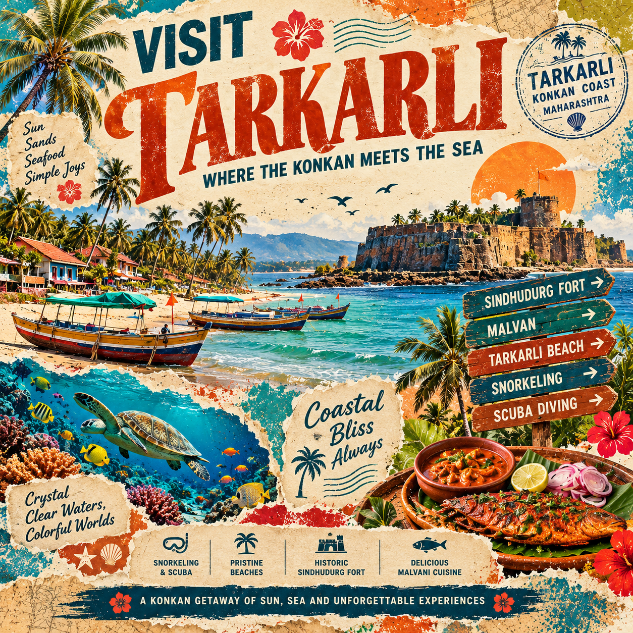
Wanderlust Stories transforms destinations into expressive vintage travel posters inspired by retro tourism campaigns, editorial magazine covers, and handcrafted scrapbook collages. Each composition combines oversized destination typography, torn-paper layers, distressed ink textures, illustrated landscapes, local architecture, regional food, directional signboards, decorative stamps, and evocative travel quotes. Every poster develops a unique visual identity based on the destination's real character, creating a vibrant, collectible travel artwork without requiring a human subject.
Create a premium, richly detailed vintage editorial travel-collage poster celebrating {{DESTINATION}}, located in {{REGION_OR_COUNTRY}}.
The artwork should resemble a collectible retro tourism poster combined with a contemporary travel magazine cover and an elaborate handmade scrapbook. Use overlapping destination imagery, torn paper, distressed printing, expressive typography, travel ephemera, local cultural details, and a visually compelling narrative.
Important: Do not include any people, human figures, portraits, faces, silhouettes, tourists, or human subjects. Let the destination itself be the hero.
1. Destination Intelligence
Analyze the destination's identity and choose a distinctive combination of real landmarks, architecture, landscapes, local culture, wildlife, cuisine, and regional objects.
Destination: {{DESTINATION}}
Region or Country: {{REGION_OR_COUNTRY}}
Signature Identity: {{SIGNATURE_IDENTITY}}
Primary Landmark: {{PRIMARY_LANDMARK}}
Secondary Landmarks: {{SECONDARY_LANDMARKS}}
Natural Environment: {{NATURAL_ENVIRONMENT}}
Architecture and Heritage: {{ARCHITECTURE_AND_HERITAGE}}
Local Cuisine: {{LOCAL_CUISINE}}
Culture and Lifestyle: {{CULTURE_AND_LIFESTYLE}}
Regional Objects and Details: {{REGIONAL_DETAILS}}
Creative Concept: {{CREATIVE_CONCEPT}}
Color Palette: {{COLOR_PALETTE}}
Main Heading: {{MAIN_HEADING}}
Subheading: {{SUBHEADING}}
Supporting Tagline: {{SUPPORTING_TAGLINE}}
Decorative Stamp Text: {{STAMP_TEXT}}
Directional Signboards: {{DIRECTIONAL_SIGNBOARDS}}
Travel Quote: {{TRAVEL_QUOTE}}
Feature Badge Text: {{FEATURE_BADGE}}
Footer Slogan: {{FOOTER_SLOGAN}}
If any variable is left blank, select suitable content based on the destination's real-world identity. Do not invent landmarks, traditions, regional foods, or cultural details.
2. Overall Art Direction
Build a layered, visually immersive collage with the energy of a vintage tourism advertisement.
Use a warm, textured paper background with irregular torn edges, overlapping illustrated scenes, distressed ink, halftone patterns, decorative splashes, and subtly faded print effects.
Combine destination imagery with carefully arranged editorial text and scrapbook-inspired travel elements. The result should feel tactile, nostalgic, adventurous, and professionally art-directed.
Avoid a simple single-scene landscape. Build a visual story from multiple connected elements that work together as one coherent composition.
3. Destination-Driven Collage Composition
Make the destination's strongest visual identifier the primary illustration.
Arrange several complementary scenes around it, using layered paper panels and irregular torn edges to create depth and visual rhythm.
Depending on the destination, incorporate:
Recognizable landmarks and characteristic architecture.
Natural environments, coastlines, forests, deserts, lakes, or distinctive terrain when relevant.
Local transport, traditional boats, markets, crafts, or regional objects.
Wildlife, plants, flowers, and other distinctive natural details.
Regional food arranged as an appealing editorial still life.
Decorative maps, tickets, stamps, signboards, and illustrated travel motifs.
Choose only the elements that make sense for the selected destination. Do not automatically include beaches, mountains, monuments, palm trees, or food dishes that are unrelated to the location.
Create a strong hierarchy: one dominant landmark or scene, two or three supporting visual panels, and smaller decorative details that reward closer inspection.
4. No-Person Composition
The destination must remain the sole hero.
Do not generate a central traveler, portrait, face, body, human silhouette, crowd, tourist, chef, local person, or any other human figure.
Instead, use a striking combination of landmarks, architecture, scenery, local products, regional cuisine, transportation, wildlife, and cultural objects to create the same sense of adventure and discovery.
If the destination would normally be represented by a person holding a camera or map, replace that subject with a destination-specific still life, open travel map, vintage camera, suitcase, compass, binoculars, or other relevant objects.
These objects must be placed naturally within the collage and must not become a substitute human figure.
5. Vintage Paper and Print Textures
Give the entire artwork a handcrafted printed appearance.
Include:
Rough, irregular torn-paper edges.
Layered cream paper, faded maps, and overlapping color panels.
Distressed ink with subtle print imperfections.
Halftone dots, grain, stippling, and scattered ink splashes.
Slightly worn poster edges and vintage paper fibers.
Screen-printed decorative shapes and botanical motifs.
Stamp marks, postal lines, small labels, and retro travel graphics.
Maintain consistency across all elements. The image should look like a carefully assembled printed collage rather than a collection of unrelated photographs.
Use realistic illustrated details and controlled texture; avoid excessive grunge that obscures the main artwork or text.
6. Dynamic Color Palette
Color direction: {{COLOR_PALETTE}}
When no palette is specified, derive a distinctive color scheme from the destination's geography, architecture, vegetation, cuisine, and cultural atmosphere.
Possible directions include turquoise and coral for a coastal destination, indigo and saffron for a culturally rich historic city, olive and burnt orange for a desert location, or forest green and golden yellow for a tropical nature destination.
Use approximately four to six dominant colors with a complementary cream or paper-toned background.
Do not reuse the same palette for every destination. Maintain the vintage print aesthetic while allowing each poster to have a recognizable and individual color identity.
7. Headline and Editorial Typography
Place {{MAIN_HEADING}} prominently across the upper portion of the square poster.
The destination name should be the largest and most immediately readable text element. Use expressive vintage display typography, such as oversized serif lettering or bold condensed uppercase type, with subtle distress and authentic printed texture.
Place {{SUBHEADING}} beneath or beside the main title as a secondary headline that identifies the destination's defining character.
Use {{SUPPORTING_TAGLINE}} as a concise, evocative line that reinforces the travel theme.
Integrate these supporting elements where space allows:
A circular passport-style stamp featuring {{STAMP_TEXT}}.
Directional signboards featuring {{DIRECTIONAL_SIGNBOARDS}}.
A short travel quotation featuring {{TRAVEL_QUOTE}}.
A decorative feature badge featuring {{FEATURE_BADGE}}.
A prominent bottom banner featuring {{FOOTER_SLOGAN}}.
Automatically adapt the language, hierarchy, and placement of these elements to the composition.
Keep the typography varied but coherent, combining bold display text, readable condensed lettering, and occasional handwritten-style accents.
All text must be relevant, correctly spelled, and visually legible. Avoid random words, duplicated labels, fabricated dates, excessive copy, or unsupported factual claims.
8. Regional Food and Cultural Still Life
When appropriate, include an appetizing, beautifully illustrated still-life arrangement of authentic local cuisine or regional products.
Use distinctive serving vessels, ingredients, traditional crafts, textiles, ceramics, or other objects that genuinely represent the location.
For Tarkarli, this could include Malvani seafood, kokum, coconuts, fishing boats, and coastal details. For a destination with a different culinary identity, choose its actual regional specialties instead.
If cuisine is not central to the destination's identity, replace this panel with architecture, crafts, wildlife, botanical details, or another meaningful local feature.
Do not force food into every poster.
9. Decorative Travel Ephemera
Surround the main scenes with a curated selection of travel-inspired graphic details.
These may include vintage passport stamps, route lines, postal marks, compass symbols, map fragments, directional signs, destination seals, small illustrated icons, shells, leaves, birds, or regional motifs.
Use these elements to connect the different collage panels and create a sense of movement through the destination.
Ensure that all stamps, signboards, and labels relate to the selected place. Avoid fabricated official seals, misleading travel documents, random dates, or unrelated cultural symbols.
10. Final Composition and Output
Mandatory aspect ratio: EXACTLY 1:1 square, 1024 × 1024.
Design the complete poster specifically for a square canvas. Do not create a portrait composition and crop it into a square.
Use the upper section for the main headline and subheading, the middle for the dominant destination imagery, and the lower section for supporting scenes, decorative details, feature labels, and the footer slogan.
Adapt this arrangement when the chosen destination requires a different balance. Keep text inside safe margins and ensure that the collage feels full, cohesive, and visually rich without becoming cluttered.
Final quality: Premium editorial art direction, highly detailed destination illustration, realistic torn-paper textures, distressed vintage printing, authentic regional storytelling, bold typography, layered collage composition, and a polished collectible travel-poster finish.
Negative constraints: No people, no human figures, no portraits, no faces, no crowds, no human silhouettes, no generic repeated scenery, no unrelated landmarks, no inaccurate cultural symbols, no invented local facts, no random text, no misspelled destination names, no unnecessary logos, no watermarks, no blank white padding, and no aspect ratio other than 1:1.