


 Image
Product advertising
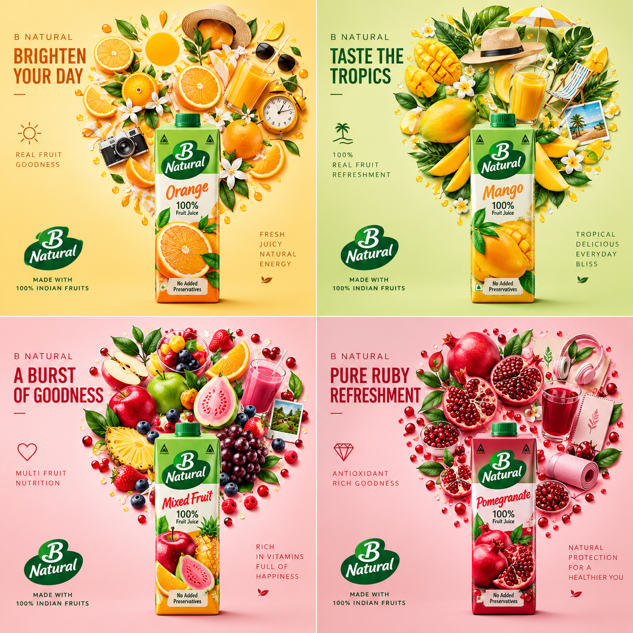
Premium Lifestyle Product Collage — Four-Variant Brand Campaign
Create a premium, photorealistic four-panel advertising collage featuring four product variants from the same brand. Each panel showcases a hero product surrounded by a beautifully arranged burst of relevant ingredients, botanical elements, and lifestyle accessories. Customize each variant with its product name, description, packaging details, colors, and campaign headline. Featuring soft pastel backgrounds, realistic studio lighting, elegant compositions, and bold editorial typography, this template is ideal for creating sophisticated beverage, food, skincare, and lifestyle product campaigns.
1. DYNAMIC INPUTS
BRAND INFORMATION
Brand name: {{brand_name}}
Brand description: {{brand_description}}
Brand identity and logo style: {{brand_identity}}
Overall brand colors: {{brand_colors}}
Target audience: {{target_audience}}
Campaign theme: {{campaign_theme}}
PRODUCT 1
Product name: {{product_1_name}}
Product description: {{product_1_description}}
Product variant or flavor: {{product_1_variant}}
Packaging details: {{product_1_packaging}}
Product colors: {{product_1_colors}}
Campaign headline: {{product_1_headline}}
Lifestyle mood: {{product_1_mood}}
PRODUCT 2
Product name: {{product_2_name}}
Product description: {{product_2_description}}
Product variant or flavor: {{product_2_variant}}
Packaging details: {{product_2_packaging}}
Product colors: {{product_2_colors}}
Campaign headline: {{product_2_headline}}
Lifestyle mood: {{product_2_mood}}
PRODUCT 3
Product name: {{product_3_name}}
Product description: {{product_3_description}}
Product variant or flavor: {{product_3_variant}}
Packaging details: {{product_3_packaging}}
Product colors: {{product_3_colors}}
Campaign headline: {{product_3_headline}}
Lifestyle mood: {{product_3_mood}}
PRODUCT 4
Product name: {{product_4_name}}
Product description: {{product_4_description}}
Product variant or flavor: {{product_4_variant}}
Packaging details: {{product_4_packaging}}
Product colors: {{product_4_colors}}
Campaign headline: {{product_4_headline}}
Lifestyle mood: {{product_4_mood}}
2. CORE CREATIVE OBJECTIVE
Create one premium, photorealistic advertising collage featuring four products from the same brand, arranged in a perfectly aligned 2×2 grid.
The creative direction combines luxury product photography, colorful ingredient styling, lifestyle storytelling, floating objects, botanical elements, and clean editorial typography.
Each panel must showcase one hero product near the lower center, surrounded by a carefully arranged composition of relevant ingredients, lifestyle accessories, and decorative objects. These elements should form a dense, circular or heart-inspired silhouette that radiates upward and outward from the product.
The result should resemble a polished international beverage or lifestyle campaign: bright, sophisticated, tactile, modern, and visually harmonious.
Generate every product entirely from its textual description. No reference image is required.
3. PRODUCT IDENTITY AND BRAND CONSISTENCY
Use the supplied brand and product information as the source of truth.
All four products must belong to {{brand_name}} and share a coherent visual identity.
Preserve the specified brand name, logo treatment, packaging geometry, material, cap or closure, label placement, colors, and product-specific details.
The four products should look like members of one product family, while their individual variants remain clearly distinguishable.
Do not change the brand name, mix product variants, invent unrelated logos, or create inconsistent packaging between panels.
When exact packaging details are unavailable, create a plausible, coherent interpretation that matches the brand description. Do not present invented packaging claims, certifications, or nutritional statements as official facts.
4. FOUR-PANEL GRID LAYOUT
Create a single square 1:1 image with exactly four equally sized panels arranged in a clean 2×2 grid.
Use narrow, consistent gutters and precise alignment. Each quadrant must read as a complete standalone advertisement while contributing to the overall campaign.
Top-left panel: {{brand_name}} — {{product_1_name}}
Top-right panel: {{brand_name}} — {{product_2_name}}
Bottom-left panel: {{brand_name}} — {{product_3_name}}
Bottom-right panel: {{brand_name}} — {{product_4_name}}
Place the hero product near the lower center of each panel. It should be large enough to read clearly, with its full silhouette visible and its base resting naturally on the ground plane.
Reserve clear negative space for headlines and small supporting copy. Never let surrounding objects obscure the product name or main logo.
Do not add a fifth panel, additional products, or an unrelated brand.
5. DYNAMIC COLOR PALETTES
Create an individual color palette for each product based on its specified variant and brand colors.
For every panel:
Use a soft pastel or lightly saturated background related to the product.
Introduce complementary colors through ingredients and decorative objects.
Keep the package distinct from its background.
Use subtle tonal gradients and soft shadows to establish depth.
Maintain consistent lighting and visual quality across all four panels.
Avoid using the same background color for every variant. The panels should feel different at first glance but belong to one cohesive brand campaign.
Never alter an explicitly specified packaging color simply to improve visual harmony.
6. HERO PRODUCT PRESENTATION
Render the hero product as a realistic commercial product photograph.
Accurately interpret its shape, scale, proportions, material, closure, label, and surface finish from the written description.
Use realistic reflections, fine surface details, natural highlights, subtle condensation where appropriate, and a believable contact shadow beneath the product.
The packaging should appear physically real rather than illustrated or excessively glossy. Avoid warped bottles, distorted labels, floating containers, impossible reflections, or inconsistent perspective.
7. FLOATING INGREDIENT AND LIFESTYLE COMPOSITION
Arrange relevant ingredients and lifestyle objects around each hero product in a visually rich, circular or heart-like burst.
The arrangement should rise above the product and spread outward, creating an elegant halo of carefully positioned elements.
Automatically select objects that support the specific product, variant, and lifestyle mood.
For fruit-based products, suitable elements may include:
Whole fruit and accurately cut fruit slices.
Fresh leaves, blossoms, and small botanical details.
Fruit cubes, droplets, juice splashes, and condensation.
Clear glasses, ice cubes, and subtle beverage accessories.
For other product categories, adapt the composition appropriately. Skincare may use botanical ingredients, flowers, and elegant bathroom accessories; fragrances may use petals, fabric, jewelry, and sophisticated lifestyle props.
Include a few lifestyle objects only when they naturally reinforce the campaign theme. Do not add random props simply to fill empty space.
Objects should have believable scale, material, lighting, and spatial relationships. Use layered depth and carefully controlled overlaps to create an abundant but organized composition.
8. PRODUCT-SPECIFIC VISUAL DIRECTION
Product 1: {{product_1_name}}
Use {{product_1_variant}}, {{product_1_colors}}, and {{product_1_mood}} to guide the ingredients, surrounding objects, background, and overall atmosphere.
Product 2: {{product_2_name}}
Use {{product_2_variant}}, {{product_2_colors}}, and {{product_2_mood}} to create a distinct visual identity while maintaining the same photographic treatment.
Product 3: {{product_3_name}}
Use {{product_3_variant}}, {{product_3_colors}}, and {{product_3_mood}} to determine the appropriate ingredient arrangement, decorative details, and visual atmosphere.
Product 4: {{product_4_name}}
Use {{product_4_variant}}, {{product_4_colors}}, and {{product_4_mood}} to complete the collection with its own complementary palette and lifestyle story.
Avoid repeating identical floating arrangements in all four panels. Each composition should be customized to its product.
9. EDITORIAL TYPOGRAPHY
Use the supplied campaign headline for each panel:
Panel 1: {{product_1_headline}}
Panel 2: {{product_2_headline}}
Panel 3: {{product_3_headline}}
Panel 4: {{product_4_headline}}
If a headline field is empty, create a short, original, memorable phrase that reflects the product's flavor, ingredients, or lifestyle mood.
Use bold, clean editorial typography with deliberate line breaks, excellent readability, and strong contrast against the background.
Place the headline toward the upper-left or upper portion of each panel, leaving sufficient space for the hero product and surrounding objects.
Supporting copy should be minimal. Use only short, original lifestyle phrases that reinforce the mood.
Do not copy slogans from existing advertisements or invent unsupported product claims. Do not add section headings, prompt labels, explanatory text, or a large title across the entire collage.
10. LIGHTING AND PHOTOGRAPHIC REALISM
Use bright, soft studio lighting with a premium commercial photography aesthetic.
Include:
Natural-looking highlights and realistic contact shadows.
Soft, directional illumination.
Accurate material response and detailed product surfaces.
Fine ingredient textures and realistic botanical details.
Balanced exposure and restrained color grading.
A clean background with subtle depth.
Consistent camera perspective and light direction across all panels.
The product should be the sharpest, clearest element in each composition. Surrounding ingredients should retain convincing detail, with natural variation in sharpness and depth.
Avoid cartoon effects, flat vector illustrations, plastic-looking fruit, excessive artificial glow, cluttered arrangements, harsh cutout edges, distorted packaging, and unrealistic shadows.
11. BRAND FOOTER
Add a slim, understated footer along the bottom edge of the overall collage.
Use the brand name {{brand_name}} or a short, original campaign-wide tagline derived from {{campaign_theme}}.
Keep the footer minimal, aligned, and visually subordinate to the four advertisements.
Do not add unverified certifications, nutritional claims, or unsupported brand statements. If no footer copy is provided, use only the brand name or omit the footer text.
12. FINAL OUTPUT REQUIREMENTS
Generate exactly one square 1:1 advertising collage containing four panels in a 2×2 layout.
Each panel must contain:
One hero product from {{brand_name}}.
Consistent and recognizable packaging.
A distinct product-specific color palette.
A carefully arranged circular or heart-inspired composition of ingredients and lifestyle objects.
A short, readable headline.
Premium photorealistic product styling and natural studio lighting.
Maintain a unified campaign aesthetic while allowing each product to communicate its own variant, flavor, and lifestyle mood.
The final image should look like a professionally art-directed lifestyle campaign, not a template worksheet, product catalog, or artificial 3D mockup.