


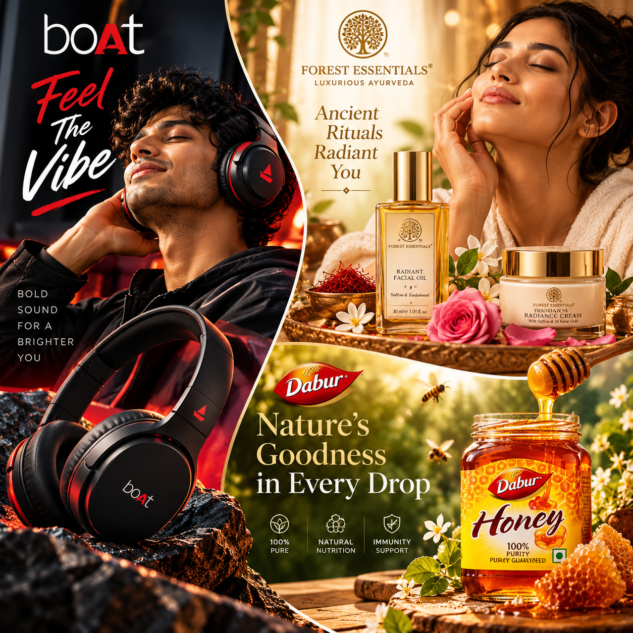
 Image
Product advertising
Brand Fusion — short, premium, memorable.
Transform three products into a premium, multi-brand advertising collage with an asymmetric editorial layout. Combine cinematic product photography, expressive models, distinctive brand colors, bold campaign headlines, and organic curved divisions. One dominant visual and two supporting campaigns create a sophisticated, magazine-inspired composition. Ideal for beauty, electronics, food, beverages, skincare, and lifestyle brands.
Create an ultra-premium, photorealistic, commercial advertising collage featuring THREE DISTINCT PRODUCTS from THREE DIFFERENT BRANDS, presented in a sophisticated asymmetric editorial composition.
CANVAS: Exact 1:1 square aspect ratio, 1024 × 1024 pixels.
DYNAMIC INPUT VARIABLES
PRODUCT 1 — DOMINANT CAMPAIGN
Brand name: {{brand_1}}
Product name and category: {{product_1}}
Product description and packaging: {{description_1}}
Campaign headline: {{headline_1}}
Brand color palette: {{colors_1}}
Model preference: {{model_1}}
PRODUCT 2 — SUPPORTING CAMPAIGN
Brand name: {{brand_2}}
Product name and category: {{product_2}}
Product description and packaging: {{description_2}}
Campaign headline: {{headline_2}}
Brand color palette: {{colors_2}}
Model preference: {{model_2}}
PRODUCT 3 — SUPPORTING CAMPAIGN
Brand name: {{brand_3}}
Product name and category: {{product_3}}
Product description and packaging: {{description_3}}
Campaign headline: {{headline_3}}
Brand color palette: {{colors_3}}
Model preference: {{model_3}}
1. CREATIVE CONCEPT
Create a premium advertising-agency editorial collage, combining three independent brand campaigns into one visually cohesive square composition.
The image must look intentionally art-directed, like a luxury magazine cover combined with a creative director's campaign portfolio.
Do not create a standard three-column layout, a 2×2 grid, three equal panels, or a collection of rectangular cards.
The defining characteristic is asymmetry: different visual proportions, flowing boundaries, a dominant hero area, and two supporting campaign areas.
2. ASYMMETRIC COMPOSITION
Divide the square canvas into three visually distinct, organically connected regions.
Dominant region: Allocate approximately 45–55% of the canvas to Product 1. Position it primarily along the left side, using a tall, dramatic composition with the main product and, when appropriate, a model portrait.
Upper supporting region: Allocate approximately 25–35% of the canvas to Product 2, positioned toward the upper-right area.
Lower supporting region: Allocate the remaining visual space to Product 3, positioned toward the lower-right area.
These percentages are approximate visual guidance, not rigid measurements.
Use elegant curved or angled boundaries between regions. Allow backgrounds, light, colors, and selected decorative elements to transition naturally across the composition while keeping each product's identity clear.
Avoid perfectly straight, uniform dividers. Use subtle, intentional separation where needed.
The final image must read as one integrated editorial artwork, not three unrelated posters pasted together.
3. PRODUCT 1 — DOMINANT HERO CAMPAIGN
Feature {{brand_1}} and {{product_1}} as the main visual anchor.
Use {{description_1}} to guide the product's recognizable silhouette, packaging, material, color, labels, and distinctive design details.
Build a visually striking environment inspired by {{colors_1}} and the product category.
Follow {{model_1}} for the model direction. If no model preference is supplied, decide whether a model improves the campaign; otherwise create a powerful product-only composition.
Position the product prominently in the foreground. Use cinematic lighting, realistic reflections, atmospheric depth, and complementary textures.
Integrate {{headline_1}} into the negative space with distinctive, legible campaign typography.
This region should attract attention first and establish the overall visual tone.
4. PRODUCT 2 — EDITORIAL SUPPORTING CAMPAIGN
Feature {{brand_2}} and {{product_2}} in the upper-right region.
Preserve the supplied product description and recognizable packaging. Create an environment using {{colors_2}}, with lighting and styling appropriate to its category.
Follow {{model_2}} for the model direction. When appropriate, show a realistic person naturally interacting with the product.
Use category-specific supporting details, such as botanical ingredients, reflective materials, fresh produce, fabric, technology, or other relevant props.
Place {{headline_2}} where it remains readable without competing with the dominant campaign.
Blend the composition into the overall collage through elegant color transitions and organic boundaries, without losing the product's independent identity.
5. PRODUCT 3 — EDITORIAL SUPPORTING CAMPAIGN
Feature {{brand_3}} and {{product_3}} in the lower-right region.
Use {{description_3}} and {{colors_3}} to establish the product's visual identity and atmosphere.
Follow {{model_3}} for the model direction. If no model is specified, choose a model or product-only treatment according to the category and creative concept.
Create rich, tactile commercial imagery using appropriate materials, environmental details, controlled highlights, and realistic shadows.
Integrate {{headline_3}} into the composition with refined, readable typography.
Balance the brightness, contrast, and visual weight of this region against the other two campaigns.
6. PRODUCT-CATEGORY ADAPTATION
Automatically adapt each campaign to its product category.
Electronics and audio: Precision materials, dramatic rim lighting, modern environments, metallic details, and sharp product silhouettes.
Skincare and beauty: Natural skin texture, botanical details, elegant glass containers, warm highlights, and refined editorial portraits.
Food and beverages: Appetizing textures, fruit, ingredients, honey, steam, splashes, or condensation where appropriate.
Fragrance: Reflective glass, atmospheric shadows, luxurious textures, and sculptural lighting.
Fashion and lifestyle: Editorial poses, expressive styling, tactile fabrics, and sophisticated environments.
Do not force the same lighting, props, color grading, or model treatment onto all three products.
7. TYPOGRAPHY AND BRAND IDENTITY
Render the three supplied campaign headlines as accurately as possible:
Product 1: {{headline_1}}
Product 2: {{headline_2}}
Product 3: {{headline_3}}
Keep brand names, campaign headlines, and product packaging visually distinct.
Preserve supplied brand identities and recognizable product details. Do not invent logos, alter established packaging unnecessarily, or add unsupported product claims.
Avoid excessive decorative text. Prioritize legibility and visual hierarchy.
8. PHOTOREALISM AND ART DIRECTION
Use premium commercial photography, realistic human anatomy, natural expressions, accurate product proportions, physically plausible reflections, convincing shadows, fine material detail, and controlled depth of field.
Maintain sophisticated contrast and rich but balanced color grading.
Use negative space strategically. Ensure that no headline, face, or important product detail is awkwardly cropped.
9. STRICT OUTPUT REQUIREMENTS
Exact 1:1 square canvas, 1024 × 1024 pixels.
Exactly three distinct product campaigns.
One dominant campaign and two supporting regions.
Asymmetric editorial layout with organic or angled boundaries.
No equal-sized panels or standard grid.
No repetitive rectangular cards or rigid three-column arrangement.
Product-specific art direction and brand colors.
Clearly recognizable products and readable campaign headlines.
Premium, photorealistic commercial finish.
No watermarks, unnecessary text, malformed packaging, distorted hands, or duplicated hero products.
FINAL CREATIVE GOAL: Produce a distinctive, premium asymmetric editorial collage that feels like a single art-directed campaign, with three brands competing harmoniously for attention through different visual scales, organic boundaries, and sophisticated commercial photography.