


 Image
Brand identity
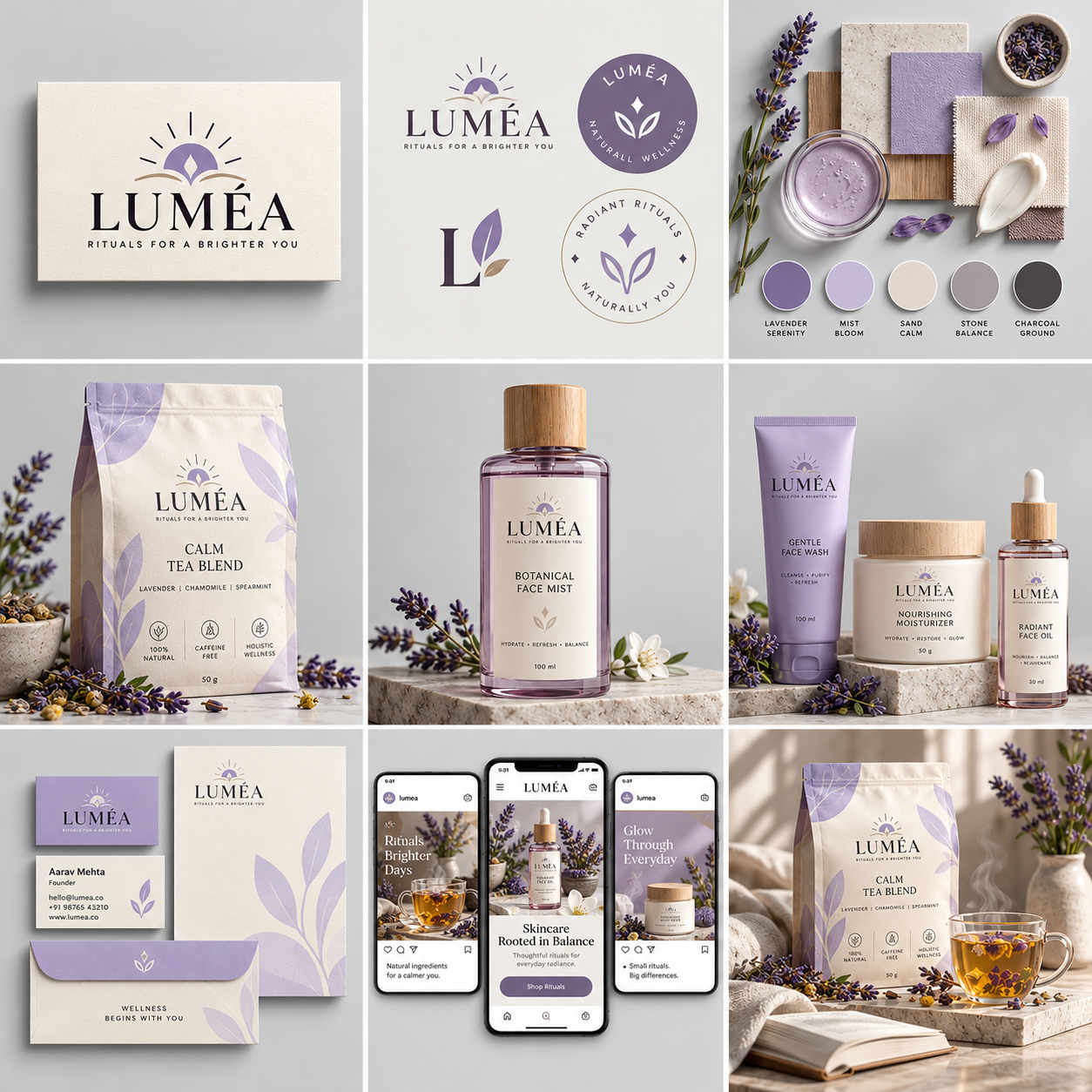
Complete Brand Identity Grid – 3×3 Premium Branding Template
Create a cohesive, professional brand identity with this dynamic 3×3 branding template. Showcase nine essential brand applications, including primary logo design, logo variations, brand materials and color palettes, product packaging, hero product photography, product collections, stationery, social media mockups, and lifestyle imagery. Designed for AI-powered customization, this template adapts to different brand names, industries, products, and color schemes while maintaining a consistent visual identity. Ideal for startups, designers, entrepreneurs, and businesses looking to visualize a complete brand system through premium photorealistic mockups and sophisticated studio styling.
Create a premium, photorealistic brand identity presentation for [BRAND NAME], a [BRAND CATEGORY] brand, showcasing a complete and cohesive visual identity system in a precise 3×3 grid layout, 1:1 square aspect ratio.
BRAND INPUTS
Brand name: [BRAND NAME]
Brand category: [BRAND CATEGORY]
Brand tagline: [BRAND TAGLINE]
Primary product: [PRODUCT 1]
Secondary product: [PRODUCT 2]
Product collection: [PRODUCT 3]
Primary color: [COLOR 1]
Secondary color: [COLOR 2]
Supporting color: [COLOR 3]
Neutral background color: [BACKGROUND COLOR]
Brand personality: [BRAND PERSONALITY]
Use these inputs consistently throughout the entire composition. Adapt the packaging, graphic motifs, materials, props, and product presentation to the selected brand category. Do not force skincare, coffee, or botanical elements into unrelated industries.
OVERALL ART DIRECTION
Create a sophisticated brand identity moodboard inspired by high-end design agency presentations, luxury packaging photography, modern editorial layouts, and minimalist studio mockups.
Use a light, seamless background, soft diffused studio lighting, realistic material textures, subtle shadows, elegant spacing, and premium commercial rendering.
The entire image must contain exactly nine distinct panels arranged in a clean, evenly spaced 3×3 grid. Use narrow, consistent gutters between panels. Each panel should present a different part of the same brand system while maintaining a consistent visual language.
The result should look like a professionally art-directed brand identity case study, not nine unrelated product photographs.
TILE 1 — PRIMARY LOGO
Show the primary [BRAND NAME] logo printed or embossed on a premium physical paper card.
Develop a distinctive wordmark and, where appropriate, a custom symbol inspired by the brand's category and personality. Use appropriate typography, balanced proportions, refined spacing, and the selected brand colors.
Include [BRAND TAGLINE] beneath the logo when suitable. Use realistic paper grain, subtle embossing, and soft directional shadows.
TILE 2 — LOGO VARIATIONS
Present a coordinated collection of secondary logo variations, monograms, brand symbols, and emblem designs.
Include a compact icon, a simplified wordmark, and an alternate brand lockup. Make every variation recognizable as part of the same identity.
Use clean presentation spacing and consistent colors. Avoid simply repeating the primary logo multiple times without meaningful variation.
TILE 3 — BRAND MATERIALS & COLOR PALETTE
Create a tactile brand materials board using the selected palette: [COLOR 1], [COLOR 2], [COLOR 3], and [BACKGROUND COLOR].
Arrange physical color swatches, textured paper samples, material finishes, and category-appropriate decorative elements in a sophisticated flat-lay composition.
Adapt the materials to the industry. For example, use glass, stone, and botanical details for skincare; paper, fabric, and printed packaging for fashion; or metal, glass, and precision-finished surfaces for technology.
Show the colors as harmonious physical samples rather than a typography specimen. Keep this panel visual, refined, and uncluttered.
TILE 4 — PRIMARY PRODUCT PACKAGING
Show [PRODUCT 1] in premium branded packaging.
Preserve the product's recognizable physical form while applying the custom logo, color palette, typography, graphic motifs, and appropriate material finishes.
Use realistic folds, labels, closures, reflections, and surface textures. Include only relevant product information and avoid unnecessary decorative text.
TILE 5 — HERO PRODUCT PHOTOGRAPHY
Present [PRODUCT 2] as the hero object in a premium commercial studio photograph.
Use carefully controlled lighting, realistic materials, sophisticated shadows, and a restrained background that complements the brand palette.
Choose props and styling appropriate to the product category. Make the product visually compelling, recognizable, and consistent with the other panels.
TILE 6 — PRODUCT COLLECTION
Display a coordinated collection of three product variations based on [PRODUCT 3].
Differentiate them through sizes, colors, formats, or variants while maintaining the same brand identity.
Arrange the products in a balanced studio composition with consistent packaging design, realistic proportions, and complementary materials. Every item should appear to belong to the same product family.
TILE 7 — STATIONERY & BRAND COLLATERAL
Create a premium stationery collection containing a business card, letterhead, and envelope.
Apply the primary logo, secondary symbol, brand colors, and supporting graphic motifs consistently. Use realistic paper textures, carefully aligned printing, subtle embossing where appropriate, and natural studio shadows.
Keep the layout elegant and professional. Avoid invented personal names, contact information, or misleading business details.
TILE 8 — SOCIAL MEDIA & DIGITAL EXPERIENCE
Show a coordinated collection of branded social media post mockups and a smartphone interface preview.
Include product campaign visuals, branded promotional layouts, and a category-appropriate digital shopping or service interface.
Maintain consistency in colors, logo placement, graphic elements, and visual hierarchy. Use realistic device proportions and clean interface layouts. Keep text minimal and legible.
TILE 9 — LIFESTYLE BRAND SCENE
Create an atmospheric lifestyle photograph featuring [PRODUCT 1] in a carefully styled environment that expresses [BRAND PERSONALITY].
Use complementary props, realistic materials, natural-looking light, and the established brand palette.
Adapt the setting to the category: a calm vanity for skincare, a styled tabletop for food, a modern desk for technology, or an editorial interior for lifestyle products.
The final scene should communicate the brand's intended mood while keeping the product as the main focus.
VISUAL CONSISTENCY RULES
Maintain exactly nine panels in a 3×3 grid.
Keep gutters, panel proportions, and background styling consistent.
Use the same logo, colors, typography direction, and visual motifs throughout.
Adapt the art direction to [BRAND CATEGORY] and [BRAND PERSONALITY].
Use photorealistic product mockups, realistic shadows, and premium studio lighting.
Ensure packaging, stationery, social media, and lifestyle scenes feel like one coherent identity.
Keep each tile visually distinct while preserving the overall brand system.
Do not add extra panels, decorative borders that disrupt the grid, or unrelated products.
STRICT NEGATIVE REQUIREMENTS
No people, hands, watermarks, unrelated brand names, copied real-world logos, inconsistent color palettes, duplicated products, distorted packaging, excessive props, messy backgrounds, random graphic elements, or illegible blocks of text.
Do not copy an existing company's distinctive brand identity. Create original brand graphics and category-appropriate design elements from the supplied inputs.
FINAL OUTPUT
A premium, ultra-realistic 3×3 brand identity grid showing nine complementary applications of [BRAND NAME]'s visual identity, including logo design, logo variations, brand materials and colors, packaging, hero product photography, a product collection, stationery, digital mockups, and a lifestyle scene.
The finished presentation should feel cohesive, sophisticated, realistic, and ready for a professional branding portfolio or AI brand identity template gallery.